This outlines a short digital media story that relates the concepts of functions and graphs (in this case, exponential functions) with real life scenarios. This sort of a project could be implemented in an algebra, algebra 2 or trigonometry class.
The scene opens in darkness with news reports about the coronavirus slowly getting louder and playing on top of each other… intense music plays softly in the background.


The reports and music fade to silence
“In the early months of 2020, the world fixated on one word – “Coronavirus”.
A picture of the virus develops out of the darkness

“A novel form of this virus, first identified in late 2019 in Wuhan, China had, by February 2020 spread throughout the world; rapidly becoming a global pandemic and raising comparisons to the Spanish flu of 1918.”


“Within weeks of its first appearance in the United States, many communities, including the entire state of Ohio, began implementing unprecedented shutdowns and restrictions on travel, work, business, and schools.”
Question mark…. Starts small and increases in size
But why did we have this reaction?
Silence and darkness…
Change in music to something lighter light coming in….
“Well, to understand why such drastic measures were taken across the country, let’s look at some of the math surrounding the data and investigate what made this enemy so concerning. When Covid-19 first appeared in Wuhan China around December 2019, the number of cases in China was very small and seemed to grow slowly….. “
Dates and numbers of cases flash on the screen 1…6… 9… 12…
In a population of over 1 billion people, a handful of cases hardly seems like a problem at first.
Dates and number of cases continue to flash on the screen (numbers growing rapidly)
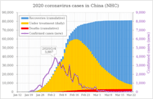
| 1/21 | 22 | 23 | 24 | 25/26 | 27 | 28 | 29 | 30 | |
| 278 | 310 | 574 | 835 | 1297/ 1985 | 2761 | 4537 | 5997 | 7736 | |
| +32 | +264 | 261 | 462/688 | 776 | 1776 | 1460 | 1739 |
But within a few weeks, the number of new cases began increasing rapidly. By February, the number of patients in China was growing by thousands daily…
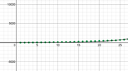
Shift to a Desmos graph showing data.
If we plot the daily number of cases on a graph, we can see a picture of how the virus was impacting the country….
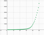
https://www.desmos.com/calculator/6iti7tx05u
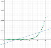
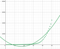
When we try to fit the best line for this data, it is apparent that linear and quadratic functions don’t work well.
Insert linear and quadratic lines (desmos)
“Instead, this kind of graph is best represented using an exponential function”
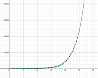
Take a look at the generic formula for exponential growth
Applied to this scenario, a represents the number of cases at the start, x represents a number of time periods (that can be represented in hours, days, weeks, months or years) and b represents the common ratio or “multiplier”. The common ratio is the key measure of growth in an exponential function. In exponential graphs, the values often start out very small and early growth can appear very low.
focus in on the early part of an exponential graph….
That low growth early on hides what is coming…
expand outward and then focus on the bend…
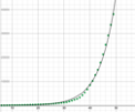
By extrapolating the graph out we see that there is a bend in the curve… a point at which the graph, or in this case, the number of patients with coronavirus, begins to grow very quickly…. More quickly than our linear or quadratic regressions would have predicted. The timing of that bend depends on the common ratio.
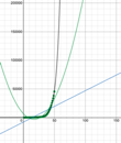
(graph to add linear and quadratic best fit lines)
Given two exponential equations having the same starting point and running for the same period of time, we can see how changing the common ratio affects the curve.
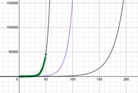
Graph is shown with different exponential functions…
Do you see how decreasing the common ratio … that is, decreasing the rate of new cases from 25% to 10% to 5%, changes the x-coordinate of the bend in the curve? While the bend still takes place, it happens much later along the x-axis, which, in our example, means it happens much later in time.
Early on, physicians and researchers realized that if steps were not taken to reduce the number of new cases, the exponential function predicted an unprecedented burden on the nation’s healthcare system. To buy time, to develop new treatments, to prepare our hospitals, to build community support, officials took unprecedented steps to reduce exposure, to limit the number of new infections, to reduce the common ratio and, ultimately, to stop the rise of new cases.
The good news is that while math and exponential functions can help explain data and make predictions, they don’t control our destiny. The early story in China looked grim, but indications are that the measures they took are turning the tide.
